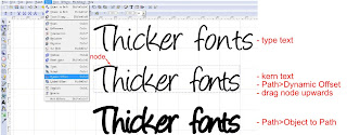
Do you have the perfect font but find it is too thin to be cut on a digital die cutter?
When selecting a font check first to see if
bold is available, as it is often sufficient for making a font thicker. If bold is not available or is unsuitable I use three different methods depending on the font chosen. I will briefly explain each method.
Path>Outset. I use this method for square or angular fonts as it maintains sharp corners.
Path>Dynamic Offset. I use this method for curvy fonts.
Path>Linked Offset. I use this method for curvy fonts and when I want to kern text after thickening the font. This method is also great for making mats for text.
The following instructions are based on the reader having some prior knowledge using Inkscape. Experiment with each method. The following examples are only a guideline to help you learn how to thicken fonts. Click on any image below to view a larger image.
1. Path>Outset
The following example shows how to use
Path>Outset. You may notice by the example the offset is dependent on the font size. If I wish to use this method I enlarge the text first, as it gives a better result. If this method is used all kerning has to be completed prior to Path>Outset.
- type text.
- enlarge font size.
- kern text (text cannot be kerned after the next step).
-
Path>Outset.
- repeat Path>Outset until font is required thickness.
- resize font smaller if required.
- save file.
 2. Path>Dynamic Offset
The following example shows the results using
Path>Dynamic Offset.
- type text
- kern text (text cannot be kerned after the next step).
-
Path>Dynamic Offset. One node will now be visible on top of the text, see image below. Very slowly drag the node upward to thicken the font. If you make the font too thick, just drag the node lower. Adjust until the font is the required thickness.
-
Path>Object to Path. Alternatively Path>Union will achieve the same result.
- Save file.
Font used above is Angelina from
dafont.com
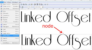
3. Path>Linked Offset.
Basic instructions for
Path>Linked Offset.
- type text
-
Path>Linked Offset
-after
Path>Linked Offset I select a contrasting colour to see the changes. This step does not have to be done. I just like to have the changes more visible and it makes it easier to kern the text in the next step.
- slowly move the node upwards. I find this is very slow on my computer. If you move the node too high it can be moved lower again. Keep adjusting the node location slowly until the font is the thickness required.
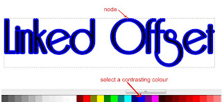
- after adjusting the thickness of the font the text can be kerned.
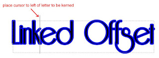
- ensure the text and not the offset is selected. Zoom in close to select the text only.
The linked path will move with any letter that is moved. More instructions on kerning
here.
- using this method gives two objects, text and linked offset.
- select both.
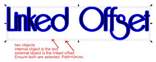
-
Path>Union. The linked offset and text will now be welded together.
- Save file.
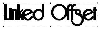
Below is a screenshot of the finished text.
Font is Riesling from
dafont.com